Pages
▼
Monday, July 22, 2013
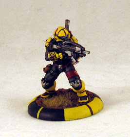
Test Model: Yellowjackets Medic
Here's how the paint-job worked out on the model I had picked out as my test. The medic model in the CCC Yellowjackets team seemed the most "standard" looking of them, so I figured it was a good one to get my bearings on.
An interesting thing in the rules-set for MERCS is that "facing" is extremely important. Which direction your model is facing, what is his forward 180 degree arc, what are his side 90 degree arcs to determine flanking, etc. I looked around a bit at some ideas others had of solidifying such facings using the base rim itself. The one that intrigued me the most was similar to this, cutting the base into 45 degree arcs so you can easily pick out any of the relevant facing information relative to the model itself.
Let me know what you guys think of the outcome. There'll be a step-by-step out soon using the Heavy Assault model.
Edit: Heavy Assault Step-by-Step here.


Awesome work, man! Definitely dig how that's turned out!
ReplyDeletethe facing info is adding an interesting flavor to the model. I like the general outcome.
ReplyDeleteUsing round bases in a rule system that requires precise orientation seems a bit...odd.
ReplyDeleteGreat paint.
I always found square bases odd. Varying length from center of base to edge, depending on angle opens up potential misuse if the game involves melee combat being "base-to-base."
ReplyDeleteAlso, the method they use for measuring distance involves "card lengths," and the cards have round cut-outs so that it's clear where the round-based model goes.